Since the introduction of the web to the general public in the early ‘90s, website design has gone through several iterations. With each stage, website constructors had to adapt their style to changing technology and user patterns. In this article, we take a look at where the industry stands today.

First, a little history
Looking back now, “antique” websites are almost laughable. Generally constrained to a maximum size that was dictated by the width of Mac Classic computers, they swam in a sea of white space on larger screens.
To top that off, website programmers would actually demand that viewers use a certain browser at a certain size format. Can you imagine?

Stage 2: Mobile devices
Although wiser heads soon prevailed and websites gradually became, in general, more user-friendly, the next major change occurred with the common use of cell phones to view websites. However, the going was pretty rocky in the beginning.
Often, the “mobile” websites were simply dumbed down versions of the “desktop” sites. Stripped of photos, graphics, and all personality, they were incredibly dry and uninviting.
Gradually, website designers and coders alike worked together to create a more pleasing experience for viewers on their iPhones and Androids. Once statistics began to show the preponderance of mobile website visits versus desktop, a new trend came into vogue:
Mobile-first design
This idea flipped the original concept on its head. Instead of designing a website on a desktop computer and then somehow “adapting it” to a mobile device, designers did the opposite. They began designing specifically for smart phones, and then “adapting” that version to larger computers (up to and including desktop computers with large-screen monitors).
Since a preponderance of website visits now occur on phones and other mobile devices, this makes more sense than the previous stage. However, it is still limiting. The problem is that while current sites can look terrific on the phone, they often lose something in the translation when “sized up” to a 24-inch monitor.

That’s where our methodology has the advantage:
Introducing the simultaneous design approach
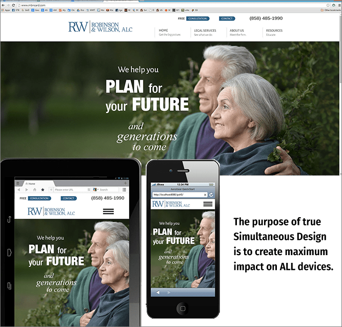
In this technique, the designer envisions how the website will look and behave on ALL devices, from the smallest cell phone up to the largest desktop monitor. There are several facets to this practice which have to work in conjunction:

Thought
The website designer must think through all the sizes at which the site might be viewed, and make sure that any and all elements will work in each of those ranges.
Experience
At the same time, the designer must have enough experience with and skill at website coding to picture exactly how the programming will function to move the site smoothly from one format to the next.
Empathy
From the website coding side, the programmer must understand the designer’s vision as well as knowing how to make the site “flow” from one monitor size to another
NOTE: At our company we call this “liquid design,” and have spent years perfecting it.
The reason this technique is so superior
Studies consistently show that users will visit your website from multiple devices, at different times. Example: Maybe they are in line at a sandwich shop at lunchtime, and find your site on their phone. Going back to the office, they return to your site on their desktop computer. Finally, a few days later, they visit your site on their iPad at home.
Ideally, your website should look and operate the same with all versions, so that the experience feels seamless to the viewer. If not, you will lose some of the ability to motivate your viewers to connect with you — which is exactly what you would want your website to do.
Why aren’t all website design firms doing this?
Excellent question! And the answer is simple: it’s difficult and time-consuming. You need a skilled, experienced team, which includes a designer and a programmer to work together to produce the final product.
After all, it’s much easier to design a site that is well-suited to the phone, knowing that it will simply “get bigger and wider” when viewed on larger devices.
Interested in learning more about this powerful design methodology? We’d be happy to explain it in further detail!


